London's 1854 Cholera Epidemic Data Visualization
Focus: UX/UI Design, Wireframing, Web Development with D3.js
Overview
Dr. John Snow's map of London's 1854 cholera epidemic was a true masterpiece. It was the first time that anyone had established a link between contaminated water and cholera. The visualization provided compelling evidence and made the case for public health policies to improve water sanitation. The map remains one of the most remarkable and insightful visualizations ever created.
Purpose
Recreate Dr. John Snow's map using today's web development tools (D3.js and svg elements) to hypothetically help someone (like John Snow) conduct an investigation.
Process
Requirements
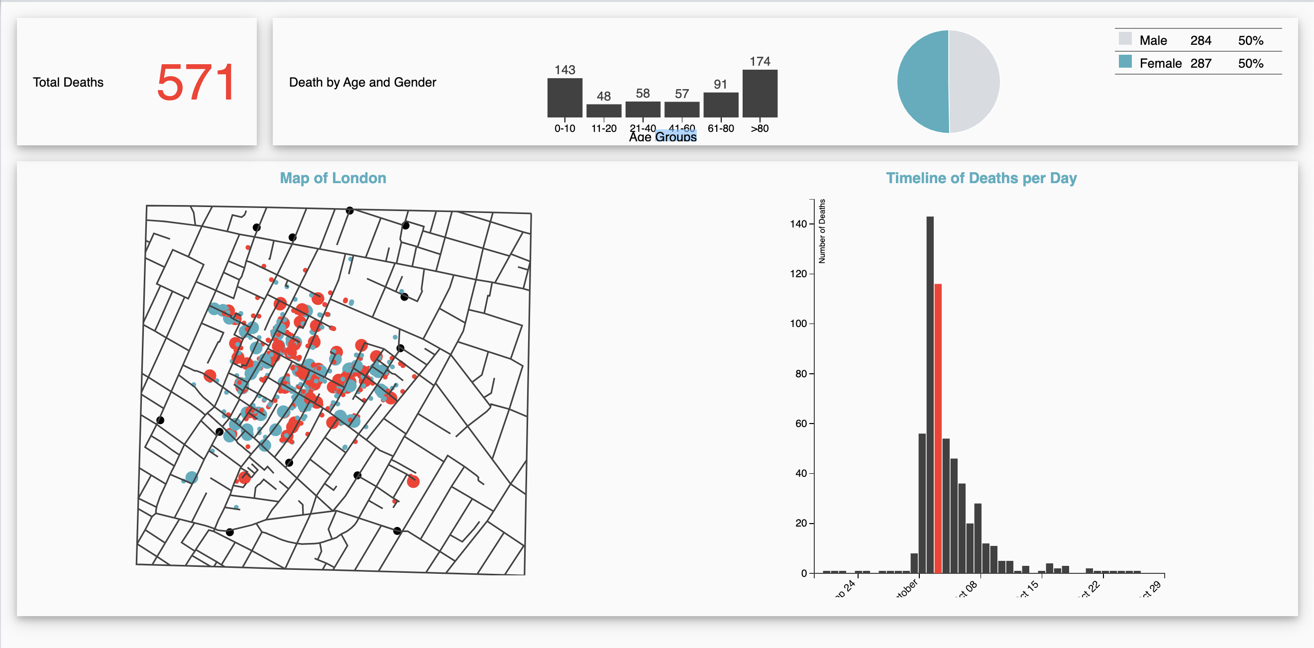
The requirements included the addition of charts to the side of the map and interface elements to make the data more interactive. I was provided with JSON and .csv files and required to draw the map using a series of connecting lines (for example:[{x1,y1}, {x2, y2}, {x3,y3}] ). I was also provided with the location of the pumps, the number of deaths for each day of the outbreak, and the location of each death in the deathdays in the correct order with information on the age and sex of the victim. The final application was required to show multiple linked visualizations of the data simultaneously to filter data by age, sex, date of death, and location.
Solution
With UX design principles and "at a glance" data insights in mind, I aimed to create a dashboard-style visualization that would allow users to interact with the data to provide multiple resources for comprehension. Each chart interacts with another in ways that display how location, age, and sex all contributed to the epidemic.
Click the frame below to view the project. In the new tab, mouse-over the chart elements to see the interactions.
Behind the Scenes
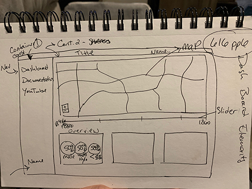
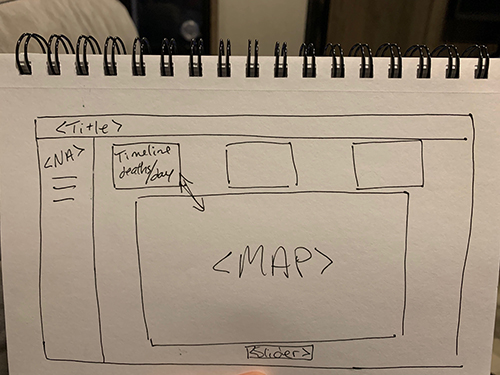
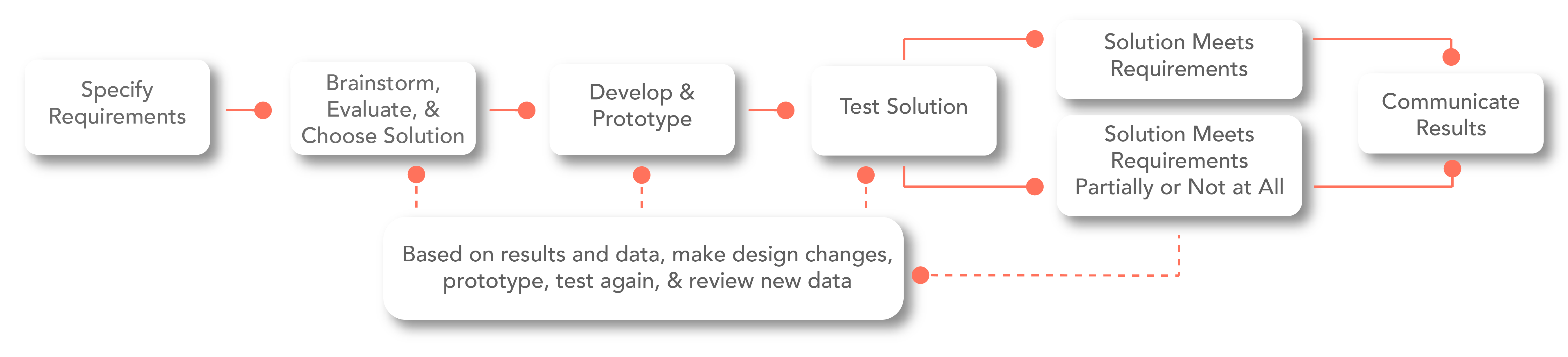
.01 Ideating
First, I performed a competitive analysis. This provided direction for the possibilities and limitations of the dataset. During this process, it became clear that a dashboard style layout would optimize the user experience and aesthetic logic. After the research phase, I sketched the initial ideas.
.02 Live Wireframing and Layout
Because I chose to limit the interactions to a one-page dashboard, developing the wireframe with HTML and CSS proved to be the most logical and iterative process. I used CSS grid and flex for each section, then SVGs were added via id and class tags.
.03 Visual Design Choices
- Coolor.io
- Color palette passed all color blind tests
- Pump Locations
- Black
- Female
- Red-Orange
- Male
- Desaturated Cyan
- Map & Bar Charts
- Dark Gray