IxD
Performance Metrics Case Study:
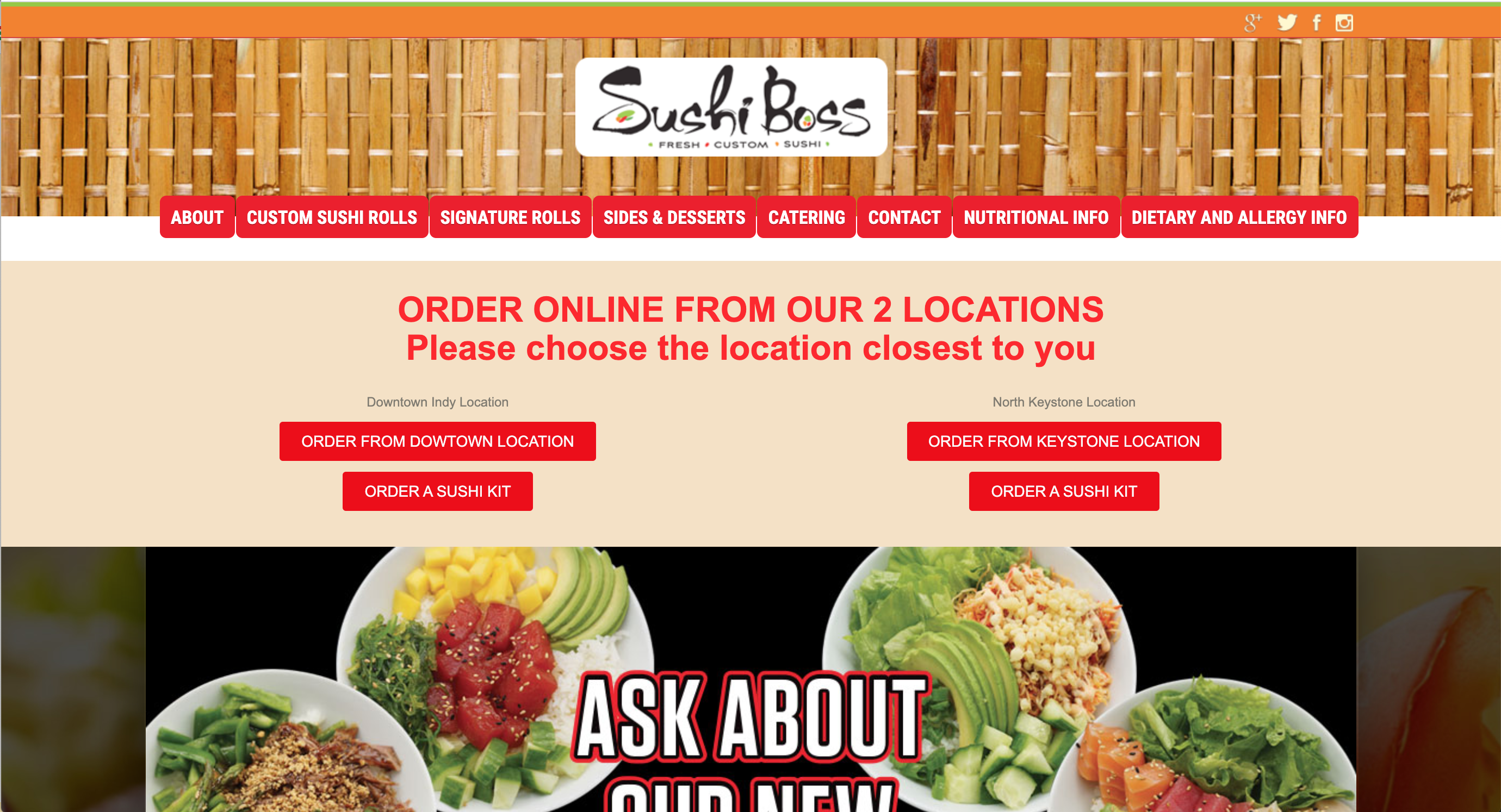
Sushi Boss Website
Focus: UX Design
Overview
Sushi Boss is an innovative sushi concept that lets you create your own sushi rolls in any combination you desire."
The Challenge
This research was conducted to provide performance metric data of the Sushi Boss website. We focused on task success, time on task, errors, efficiency, and learnability. The findings and recommendations were then communicated with the owner for review and the opportunity to continue the research.
Our high level goals were to determine and assess the ease of use to complete common tasks on the site:
- Viewing the menu
- Ordering food online
- Viewing & understanding the nutrition and dietary information
Additionally, we assessed how well the site represents the Sushi Boss brand and uncovered specific, content based questions that arise when customers attempt to complete the common tasks.
Sushi Boss Home Page
Findings & Recommendations
The following recommendations were sent to the owner of Sushi Boss. They were derived from calculating the probability of detection for issues found with heuristic evaluations, as well as user feedback from study sessions, the proportion of task successes versus failures, and the system usability scores (SUS) rating.
- Aesthetic & minimalist design. Declutter and create visual hierarchy with an updated, modern design.
- Top priority tasks. Provide clear starting points for the site's 3 main goals.
- Avoid PDF for viewing the menu. Reduce frustration and slow task completion times by converting the menu to a standard webpage.
- Simplicity over abundance of choice. Decrease fatigue, frustration, and abandonment by offering fewer navigation choices and CTAs.
Behind the Scenes: Data Collection Methods
.01 Heuristic Evaluations
Our team performed heuristic evaluations of the Sushi Boss website based on the Nielsen Norman Group’s ten heuristics in order to gather qualitative data as well as assist in identifying pertinent design issues. The experiment shows how evaluations are a useful means to identify design issues that are often overlooked.
Four research team members evaluated the desktop version of the website and recorded the heuristic number and description of the issue. We then met to collate our data and determine the rating, frequency, impact, and persistence of the issues. From our findings, we determined a list of ten common issues. We charted these ten common issues and calculated the probability of their detection during the website’s use by users in an everyday setting.
List of Issues:
- Multiple locations exist to view food options
- Pictures often change in size when interacted with subtly
- The link to Grubhub’s third-party ordering system is faulty
- Multiple PDF files are required to view information
- Lack of detail in menu item descriptions
- No root “Menu” option
- The overall design is cluttered and not minimalistic
- Images are expanded at inappropriate times and make it difficult to view data
- Difficulty level of discovering nutritional information for specific rolls is too high
- It is often difficult to find available menu options
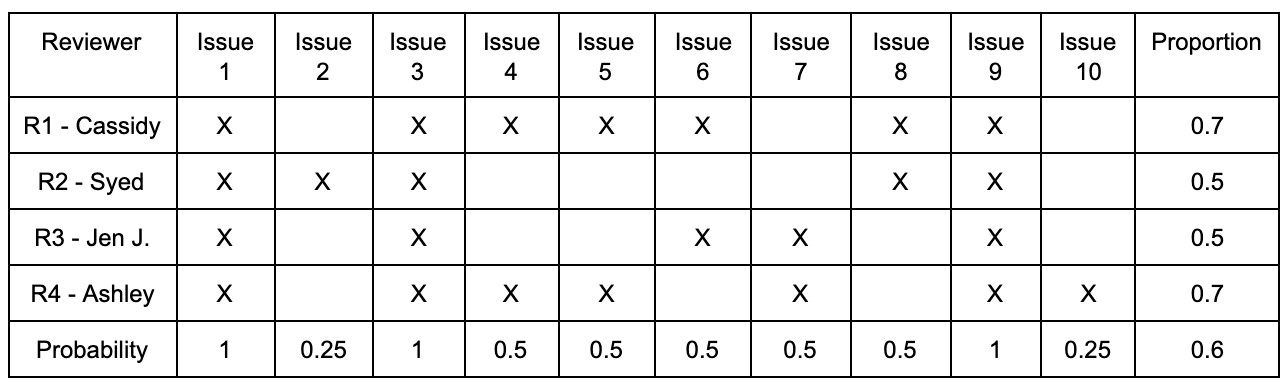
Probability of Detection Calculation
1 - (1 - 0.6)^4 = 0.9744 = 97.44% of the issues would be found with a sample of 4 users from this study.
.02 User Analysis
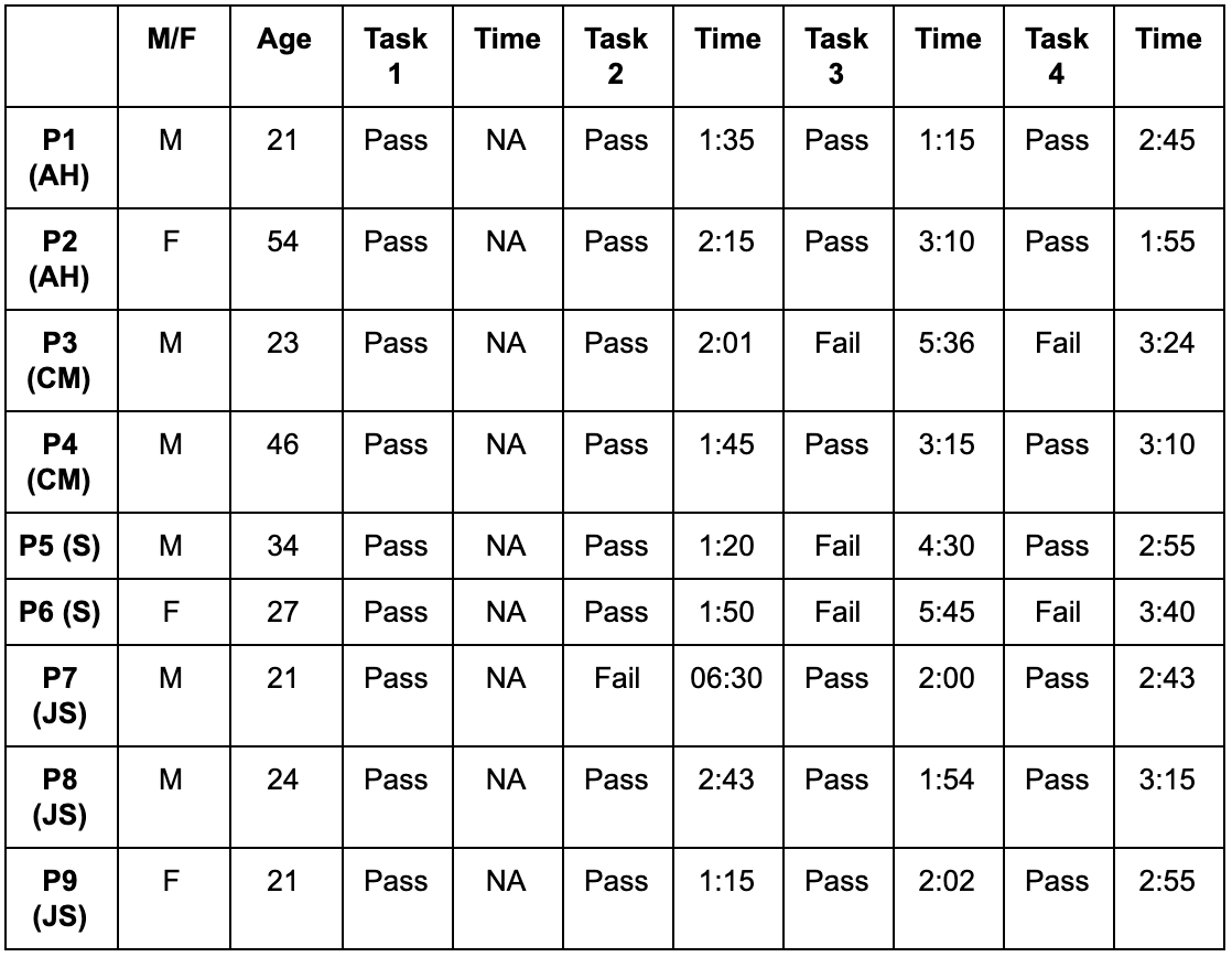
Using a think-aloud method, 9 participants, 3 female and 9 male, ranging in age from 21 to 54, were asked to perform the following tasks and complete a System Usability Scale survey:
- Initial Impression: Without leaving the homepage, please describe outloud your initial thoughts about the Sushi Boss website.
- The Menu: Use the Sushi Boss website to view the available food options.
- Online Ordering: Use this site to order ‘The Greenhouse’ roll for delivery. Go as far as you can without actually placing the order.
- Nutrition Information: Now, please find the nutrition information for the California Roll.
- Dietary Information: Next, please find menu items that are vegan-friendly.
First Impressions & User Feedback
Many of the comments the users made during the first impression question reflected our own thoughts as researchers and designers. They helped to validate many of the same issues we identified during the heuristic evaluation. For example:
"It seems disorganized, it looks busy... "
------
"I shouldn’t have to open a PDF to view the menu."
Data Analysis
After the think aloud sessions, our team calculated the proportions of success, average time on task, and confidence intervals for each task. The "initial impression" task was not included in this analysis.
Proportion and Confidence Intervals
Calculating the proportion data is simple math, just a basic percentage. But we chose to dive deeper and calculate the confidence intervals by determining if the p-value is less than 5% (yay statistics!), which can be considered statistically significant. A p-value < 5 is the same as a 95% confidence.
Confidence intervals are important in UX research so we can manage risk. However, it's important to note that our sample size was quite small (n=9). So in addition to the 95% Confidence Intervals, we set another, more realistic predefined goal by asking, "How likely is it that 70% of all users would be able to complete each task?".
We could have calculated the results manually, but math is hard time is important and we used this tool and this tool to streamline the process and get accurate answers to our questions.
Data Analysis - Results
Task 1 (Observation) - No proportion data
Task 2 - "Use the Sushi Boss website to view the available food options."
- Eight out of nine (89%) participants completed the task.
- We can be 95% confident that the actual population completion rate is between 54.31% and 100%.
- There is a 99.9999% chance that the completion rate exceeds 70%.
- There is 0.00001% chance that the completion rate is below 70%.
Task 3 - "Use this site to order ‘The Greenhouse’ roll for delivery. Go as far as you can without actually placing the order."
- Six out of nine (66%) participants completed the task.
- We can be 95% confident that the actual population completion rate is between 35.08% and 88.28%.
- There is a 99.9999% chance that the completion rate exceeds 70%.
- There is 0.00001% chance that the completion rate is below 70%.
Task 4 - "Find menu items that are vegan-friendly."
- Seven out of nine (78%) participants completed the task.
- We can be 95% confident that the actual population completion rate is between 44.26% and 94.66%.
- There is 0.00001% chance that the completion rate exceeds 70%.
- There is a 99.9999% chance that the completion rate is below 70%
Results Explained
Task 2 was the easiest for users to complete. The task involved participants using the site to find available food options. 89% of users were able to complete the task. This is the task that took the least amount of time to complete when compared to all other tasks.
Task 3 was the most difficult for participants based on success/failure rates and time on task. Task 3 asked each participant to use the Sushi Boss website to order ‘The Greenhouse’ roll for delivery. One participant struggled with this task due to limited vision. Other participants struggled with this task due to an error with the GrubHub third-party link. The error involved the links being inconsistent and one failed to take users to the Sushi Boss online ordering page all together.
Task 4 was completed by 78% of users. The task required participants to find vegan-friendly food options. Some users struggled to find the vegan-friendly dishes because they were looking at the menu, not the nutritional information as the nutritional information is located in a different area on the website’s homepage.
Attitude & Satisfaction Ratings
After completing the tasks, participants rated their satisfaction of the site using the System Usability Scale (SUS) form. The SUS is a five-point Likert scale questionnaire, measured from 1 to 5, with 1 being strongly disagree and 5 being strongly agree. The questionnaire helped our team find user trends for frequency of use, site complexity, ease of use, need for assistance, site inconsistencies, site learnability and confidence using the site.
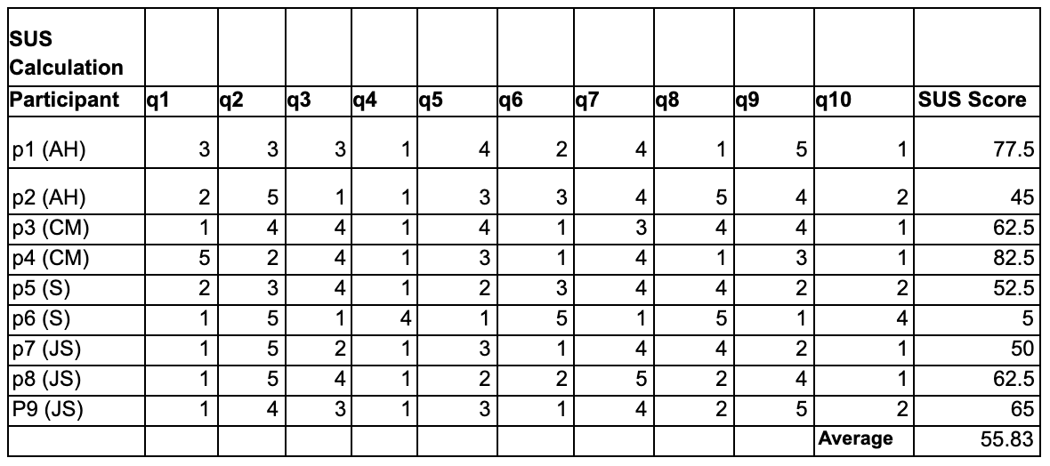
The average SUS score that our team calculated was 55.83, which is a fair amount less than an acceptable score of 70 or higher. On the SUS questionnaire, questions one, four, and ten were consistently given a low ranking.
- 1 - I think I would like to use this website frequently.
- 4 - I think I would need assistance to be able to use this website.
- 10 - I needed to learn a lot of things to be able to use this website.
Summary of User Testing Sessions
In general, the majority of participants were able to complete the tasks successfully. However, the confidence intervals weren't promising and time on task recordings were extremely long given the presumed difficulty level of the tasks. The average time on tasks ranged from 02:21 to 03:16 and when we consider that one of the tasks was to find a specific menu item, a common task of the site, we can assume that this should only take an average user with no limitations under 60 seconds.
Additionally, the low scores on the SUS show that, while the users were generally able to perform the necessary functions and tasks, they would prefer not to use this site for its intended functions.
Conclusions
From the usability testing, heuristic evaluations, SUS scores, and computed values (i.e., confidence levels and average task completion time) insights were gathered regarding some key issues. The team was able to observe that, overall, the website infringes upon the user’s journey to reaching the information they need by requiring extra steps and searching. While the majority of the participants were able to successfully complete the tasks assigned, the team noticed that average completion time was high. This would be acceptable with a more complex task, but unreasonable considering the simplicity of the ones distributed (i.e., find the menu).
The team noticed that users were required to leave the website to complete specific tasks (i.e., order online, view the menu). This was not what the users expected or desired. Overall, the website was not minimalistic in design and aesthetic - but most importantly, it was not a streamlined experience for the participants involved. Elements were cluttered and overwhelming for a majority of the users tested. When observing the functionality of the website, one should aim for a streamlined experience for the end user. This complexity could be improved - a key example being providing users with the ability to view menu item details from the menu by interacting with the item as it is listed in one convenient location within the website.