The Design Process
I began designing this visualization by first performing what could be considered "competitive analysis". I found it very useful to see how others have tried to visualize the same set of data and similar sets of data as well. This gave me an idea of the possibilities and limitations of the dataset and also the idea to do a dashboard-type of layout. After the research phase, I sketched some initial ideas.
.JPG)
The first sketch shows a title bar at the top, a left-side navigation, and a main area for the charts. The map is at the top while some "callout" stats are listed below.
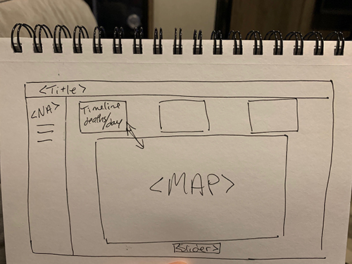
The second sketch is a cleaned up version of the same concept. Using the layout with the title bar, side navigation, and main chart area is a very common setup for dashboards that works well for the user experience and visual organization.
After sketching, I set the html and css layout using CSS grid and flex for each section. SVGs were added via id and class tags.
Design Choices
My design choices, as described previously, began with layout to optimize the user experience and aesthetic logic. Next, I carefully chose a color palette and immediately tested it agained a color blind tool. The app I used was Coolor.co, which is a color picker and it includes the tool to see how inidividuals that are color blind would see your color choices.
Each color of the visualization was then carefully applied:
- Background color: white - this was chosen to ensure the statistics, graphs, and illustrations were easy to distinguish.
- Title bar and side navigation: light gray - this is a muted color to show that the information is available but not he main focus of the visualization
- Total Deaths stat: bright redorage - I wanted this number to pop out for an instant gratification of information.
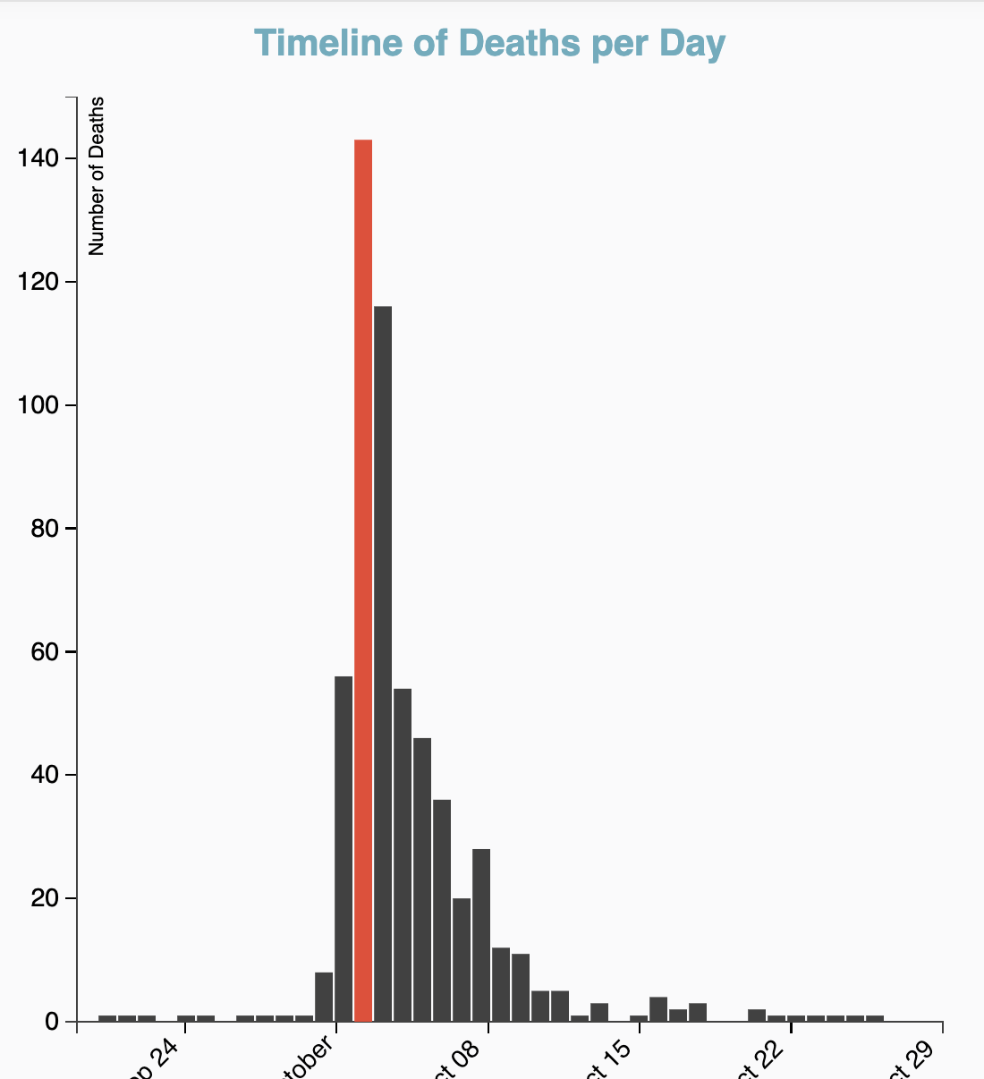
- Both Bar graphs/histograms: Dark Gray with bright redorange highlights - Here, I wanted the mouse over functions to be dramatic with the bright color, and not distracting when not engaged
- Map lines: dark grey - again, this was done to provide clean lines that don't distract from the scatter plot of deaths
- Pumps: black - these are black and a larger size that the deaths so that they are noticeable and do not interfere with the death dots.
- Death dots: these are blue and bright redorange per male and female victims, respectively. While it wasn't my intent when choosing the color palette, this contrast works very well here and makes sense for users, who typically associate similar colors for center roles.
Questions and Discoveries
During the beginning stages of this process, I didn't have any initial questions. My focus was to get the data into the visualization that would make the most sense. However, as I was working, I discovered that some of my assumptions on how to best represent the information was incorrect, which led to further insights.
Assumptions and Outcomes
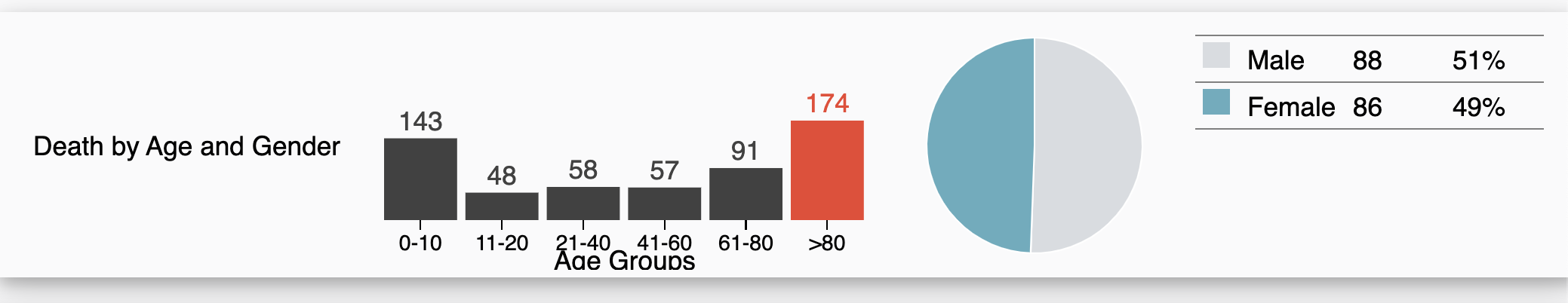
- (assumption) All the stats at the top should be large numbers or percentages: This was not only false, it just didn't make sense for the data we had available. I found more useful information and put it at the top of the dashboard instead.
- (assumption) The age groups didn't mean much and were of little use: Again, this was false. I found this information very useful and interesting when compared to the gender data. I was able to discover here that while in general, the gender for deaths was split 50/50, the age group 41-60 was dominately female while the 21-40 group was mostly male. I wouldn't have noticed this without combining and visualizing this data.
- I also found it interesting in the histogram and pie chart interaction that the idea that children and elderly are more susceptible to sickness related death, at least in this case, is true. There is a clear margin between the age ranges and the youngest and oldest groups had the highest death rates